
Turning quiet compassion into the courage to give.
A focused redesign of the charity's website that clears the path from emotional story to donation, and opens up more ways for people to help.
The stories did their job and moved people, but the path to actually give was buried, busy and easy to lose. Good will was not turning into donations, and only a narrow set of giving options was on offer.
I audited the experience and redesigned around a single principle: tell the story, then put the donation moment right where the feeling peaks. I also opened up more ways to give, all while staying true to an established brand.
The Sick Children's Trust gives families a free "Home from Home" close to their seriously ill child's hospital bed, so no parent has to choose between being there and getting by.
It is a deeply human mission, and the website is where that mission either earns support or loses it. Every donation keeps a family together at the hardest moment of their lives. That raised the stakes of the redesign: this was not about clicks, it was about whether someone moved by a story could actually turn that feeling into help.
People felt the stories. They just could not easily find the moment to give, so compassion quietly drained away before it could become a donation.
I started by walking the existing site as a donor would, mapping where attention built and where it leaked. The pattern was clear: the emotional content worked, but the interface around it competed for attention and hid the one action that mattered.
From there, every decision answered one question, does this help a moved visitor give, or get in their way? Anything that did not earn its place came out.
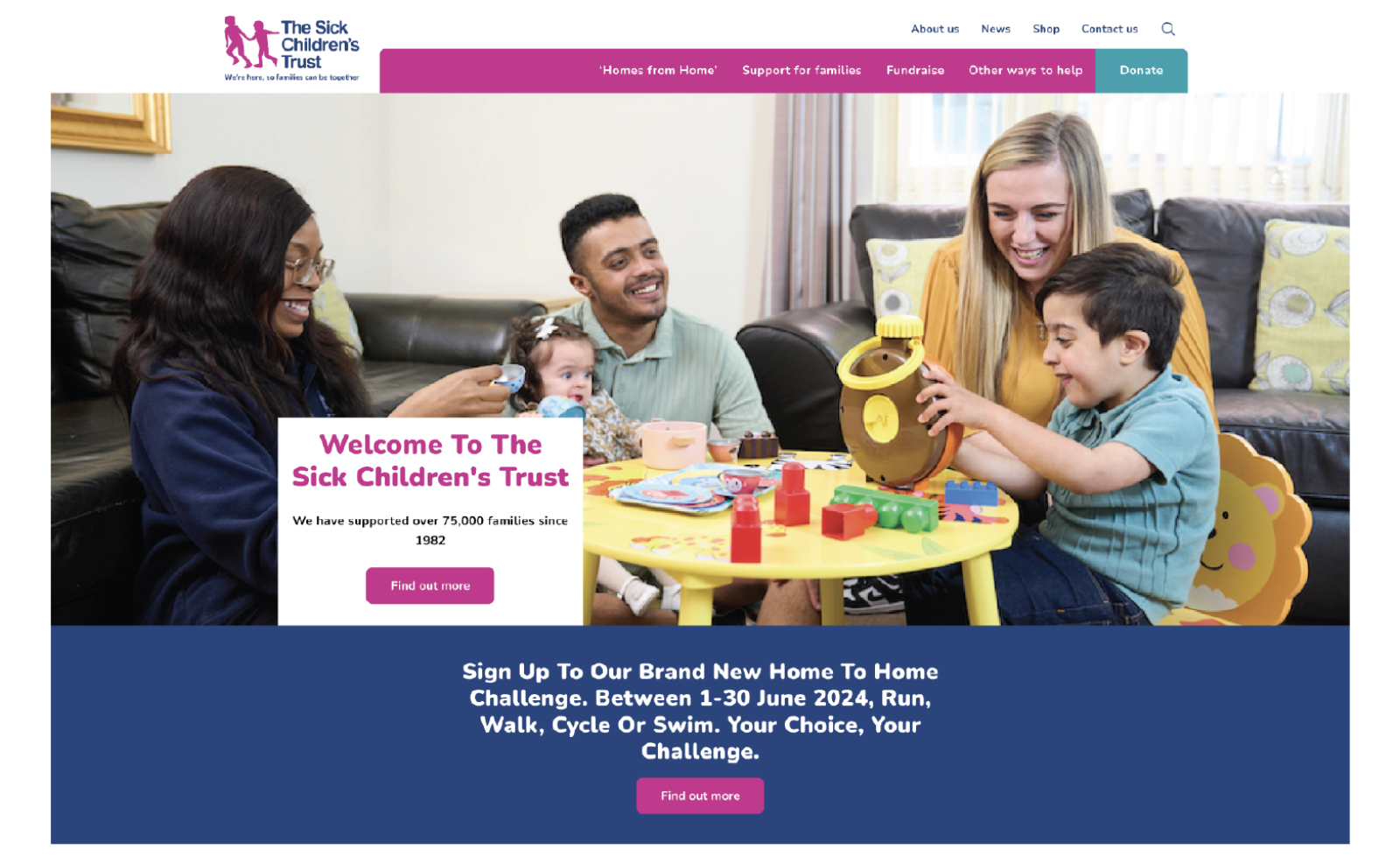
I refined the colour scheme, reorganised the logo and menu, and gently dimmed the hero imagery so it set the mood without shouting over the message. The result is a quieter page where the eye lands naturally on the call-to-action, with the brand still unmistakably itself.

The biggest unlock was timing. I placed a clear, simple donation moment directly after the storytelling, the instant a visitor feels the most. Instead of asking people to go hunting for a way to help, the help is right there, the second the feeling peaks.

Not everyone gives in the same way, so I expanded the options beyond a single one-off donation, adding routes like gifts in wills and product giving. Meeting people where they are, with the level of giving that suits them, widens the door to support without adding pressure.

The redesign reconnects the two things that had drifted apart: the emotional pull of the charity's work, and the simple act of giving to it.
Designing for an established brand taught me to improve a service without losing the trust its identity had already earned.
The Sick Children's Trust · Mo Rezaei · UX & UI Design